
How to Use Pre-designed Templates Authentically
When it comes to showing up online, the hardest part isn’t always what to say — it’s how to present it in a way that feels both polished and personal. That’s why I’ve created ready-to-use designs: so you don’t have to start from scratch. Think of them as a structure, already built, waiting for you to move in and make it your own.
Framework is Ready. The Story is Yours.
The designs are a starting point—what I like to think of as a visual framework. The headlines, supporting text, and suggested imagery are already set up for you, but the magic happens when you step in with your own story, photos, and voice. That’s when the framework becomes a reflection of you.
In this post, I’ll walk you through a few simple but powerful ways to adapt the designs: swapping in your own images, customizing reel covers, and even expanding posts with additional slides. My hope is that you come away not only with polished content, but also with the confidence to make it feel completely your own.
Here’s how you can take pre-designed social media templates and turn them into something that looks and feels uniquely yours:
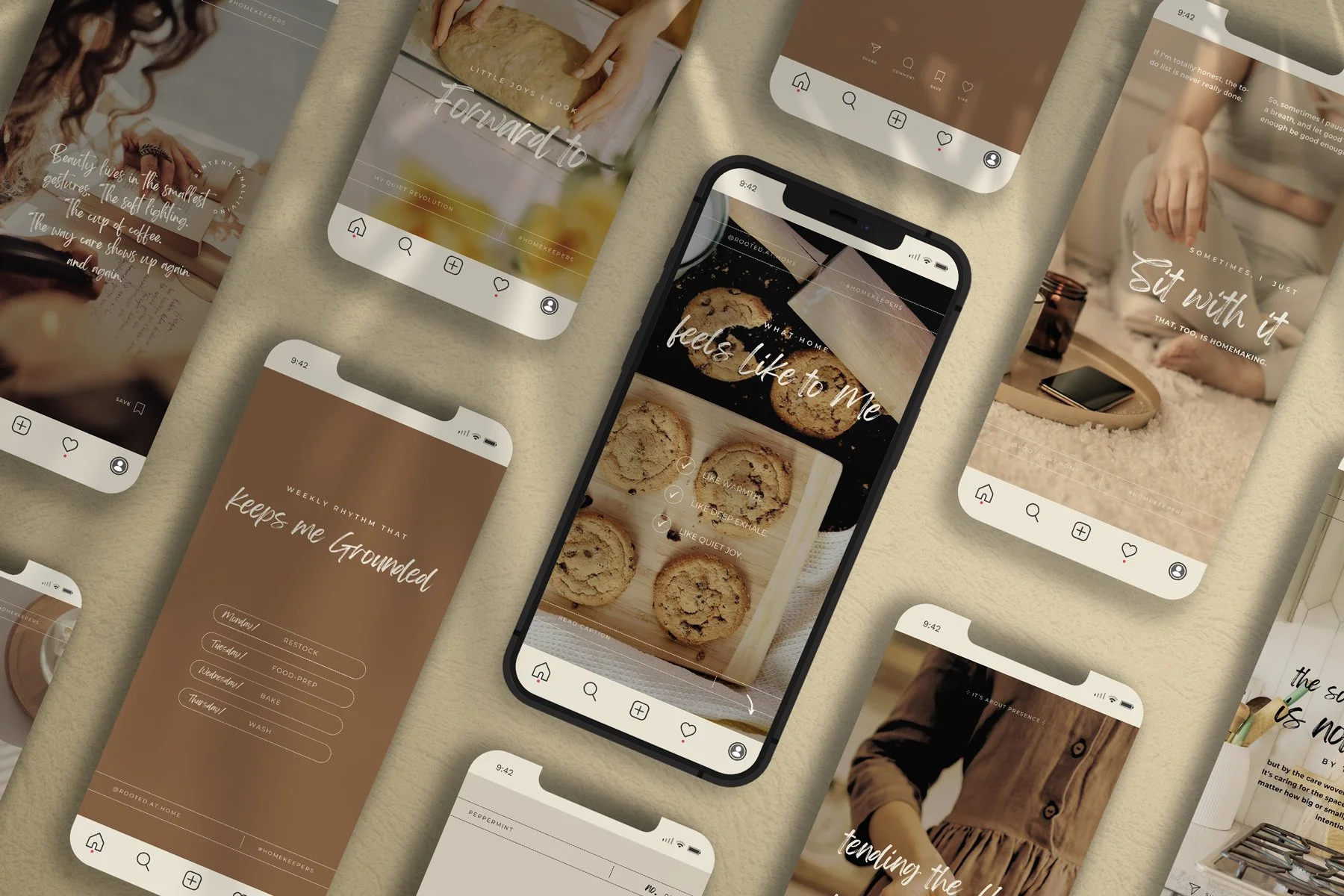
1. Swap Out Stock Images for Your Own
Every design comes with suggested imagery, but don’t stop there. Replace the placeholder photos with snapshots from your own world — a bloom from your garden, your hands kneading bread, jars of herbs infusing in the sunlight, or even a quiet corner of your workspace.
These glimpses don’t have to be styled or staged to be meaningful. The goal isn’t perfection; it’s connection.
When your audience sees your face, your home, or your creations in action, it builds trust. They feel like they’ve been invited into your life rather than scrolling past another polished but distant post. Your story becomes real, relatable, and worth remembering.
Pro Tip:
Choose a consistent editing style — warmer tones for coziness, brighter for freshness, or muted for calm. This simple step makes your whole feed feel intentional and harmonious, even if the photos are taken on different days. Over time, this consistency will become part of your visual signature.
2. Use Designs as Reel Covers
Reels are one of Instagram’s most powerful tools for growth, but the cover image often gets overlooked. Instead of letting Instagram grab a random freeze-frame, upload a custom cover using your design framework.
This small, mindful step ties your fast-moving video content back into the steady rhythm of your overall feed. When someone lands on your profile, they’ll see a grid that feels cohesive and inviting, rather than a mix of mismatched thumbnails. This consistency not only makes your page more visually appealing, but also communicates that you’ve put care into the details. And that care is what makes people stay.
Pro Tip:
Add a short, clear title to the cover — “Herbal Tea Ritual,” “Garden Tour,” or “3 Ways to Use Calendula.” These little text cues let your followers know exactly what they’re about to watch, making them far more likely to tap play.
3. Expand a Post Into a Carousel
Not every message fits into a single square. Sometimes your story needs space to breathe. Carousels are perfect for this — they allow you to stretch a thought, show a sequence, or invite your audience to pause and engage a little longer.
With these designs, you’re not limited to the single-post format. You can easily add extra slides that carry your imagery or ideas further while keeping the overall look consistent. Think of it as unfolding a story page by page.
Here are a few ways to use this approach:
Teach in steps: Start with a headline slide like “3 Ways to Simplify Your Morning Routine”. Then dedicate one slide per step, and finish with a summary or reminder to save the post.
Show a transformation: Begin with a before image or quote that sets the stage. Use the middle slides to highlight progress or process shots, and end with the “after” image or reflection.
Tell a micro-story: Open with a thought-provoking question or quote. Continue with 2–3 slides of visuals that illustrate your story. Close with a takeaway or gentle call to action, like “What part of this resonates with you?”
Highlight a product or project: Feature the main item on the first slide, then zoom in with supporting details, ingredients, or uses across additional slides. Wrap up with an invitation to learn more, order, or share.
The key is rhythm and flow. Each slide should naturally lead into the next, creating a little journey rather than a single quick glance. This not only increases engagement but also deepens your audience’s connection to your content — they aren’t just scrolling past, they’re moving through an experience you’ve curated.
4. Add Your Colors and Fonts
Even within a ready-made framework, you can bring in your own visual language. Swap the colors for ones you love or that align with your brand. Use the fonts you already feature on your website, or choose something that reflects your tone — soft and handwritten, or bold and timeless. Adjust filters, introduce textures, or replace stock images with photography from your own home, garden, or workspace. These subtle touches shift the design from “generic” to unmistakably yours.
Think of it as moving into a well-built house: the walls, roof, and rooms are already in place, but you decide on the paint colors, the fabrics, the art on the walls. Whether you lean earthy and organic with muted greens and warm neutrals, elegant and feminine with soft pinks and script fonts, or rustic and timeless with sepia tones and classic serif typefaces — these changes reflect who you are.
These details may seem small, but they carry weight. They signal to your audience that your presence is thoughtful, consistent, and infused with care. Over time, they’ll come to recognize your posts before even seeing your name — not because of the framework itself, but because of the unmistakable way you’ve made it your own living space.
5. Keep the Structure, Change the Story
One of the most effortless ways to work with these ready-made designs is to treat them as a steady framework: headline, supporting text, and imagery. You don’t have to reinvent the wheel each time you post. Instead, keep the layout the same and simply replace the content with your own words, images, and ideas.
This approach creates a rhythm your audience can rely on. The repeated structure brings a sense of trust and recognition—like a familiar doorway they know how to walk through. At the same time, the story you tell inside that structure shifts with each post, keeping things alive and personal.
For example, one week you might use the design to share a seasonal recipe. The next, the very same layout could hold a gardening tip, a motivational quote, or a peek into your daily routine. While the look remains consistent, the heart of the message is always new.
Think of it as tending a garden bed: the frame stays the same, but the plants change with the season. The soil is steady, but what grows there is always evolving. In the same way, the framework of your designs supports you, while your stories breathe life into the structure.
The beauty of this method is in the balance.
Your feed feels cohesive and polished, but never predictable or stale. Followers know what to expect visually, yet they’re always discovering more of your voice and your world. Over time, this combination of consistency and freshness deepens connection.
The point of these designs isn’t to hide behind something polished — it’s to give you a foundation so you can show up with less stress and more clarity.
You don’t need to be a professional designer to create a feed that feels inviting. You just need a framework that takes the guesswork out of the process, while leaving plenty of space for your story to shine.
So swap the photos. Play with colors. Expand a post into a carousel. Add your reel covers. Above all, keep showing up with your own words, your own presence, your own life.